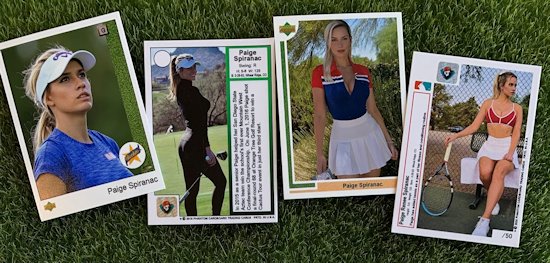
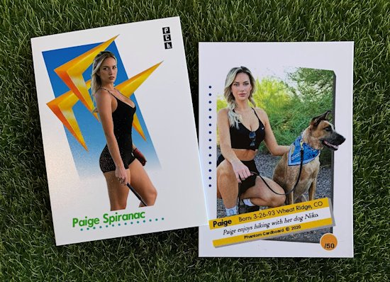
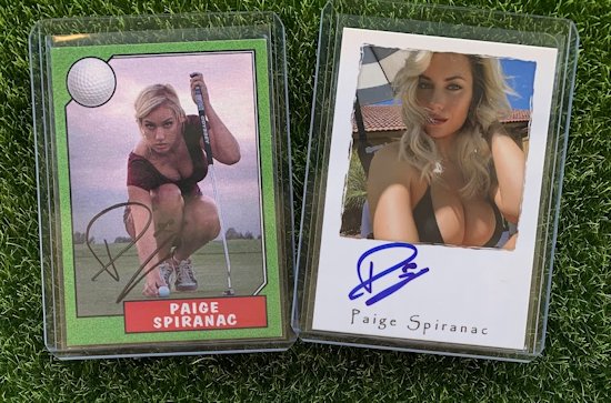
With my cards, the bulk majority of what sparks my interest is creating cards that are vintage inspired. The idea is creating cards that look like they could have existed back in time. I don't go too far past the early '90s, when the companies really started to modernize in their card's presentation with newer technologies. That was exciting, but for me the passion and artistry is in the older, more dated card designs. It's all about the nostalgia.
Occasionally I do dabble with designs that are original and a tad more modern looking. These cards are typically cards I'm making for myself in hopes of getting them autographed. When doing so I typically draw inspiration from designs from Upper Deck or Topps, not so much Panini -- I find their cards, design-wise, to be bland, boring and redundant.
I got an idea for a Rose Namajunas card. I wouldn't consider myself an MMA "junkie", but I am a fan of "Thug Rose" and wanted to create a card in hopes of getting her autograph. I love Rose's whole demeanor and humility. I also really like how that humility and her appearance really belies her skill level. She's an absolute warrior.
So, I set out to make a card that would have a little more modern appeal as MMA didn't even exist in the time period that most of my cards are designed to emulate. I started by looking for an image that caught my eye. I knew a good way to achieve and more modern look would be to have the image full-bleed, meaning no border framing the card. I made the image black-and-white as it helps a would-be autograph "pop". From there I added some subtle touches that helped identify it as an MMA card, but as to not distract from the image. I really am happy with the end result and even happier to have it come back to me signed.


