Friday, May 31, 2019

Jackie Stalegum Lives!


I’m a sucker for mascots, logos and graphic design in general.  There’s a few nostalgia clothing brands I follow online that I've really been influenced by with their character branding.  I wanted to do something like that with my card brand.  I wanted to establish a cool logo / mascot that could be instantly associated with Phantom Cardboard.

I came up with my first logo when I started to realize that making custom cards wasn't a passing fancy, but rather a passion to create and connect to childhood loves.  I love branding and wanted to make something symbolic of my cards.  My first attempt at this was a little cute ghost character.  It kinda looked like a cross between that video game character Kirby and the ghosts found in the Mario Bros. castles.  I sent that image to friends to get their takes on it.  The response was just okay, and I wanted something better than that.
I was originally going to spell it Fantom Cardboard

I went back to the drawing board and took a bit of a more literal approach.  A Phantom of the Opera style mask wearing a baseball hat was the new direction I took.
Version 1.0

Not too long after creating my logo I saw that Matthew Skiff had some openings for commissions.  Matthew is a prolific graphic designer and has done some of the coolest nostalgia pieces that you can find on the internet.  His stuff is epic and I’ve admired his talent for years, so I jumped at the chance to have him design something for the PCb. brand.  This was back in September of 2017.

Basically I was looking to have my basic concept polished and refined by Matthew’s skill.  He took and executed my ideas flawlessly, and was a pleasure to work with with each and every one of my little tweak requests.  Needless to say I couldn’t have been happier with the results.  He translated the vision I had perfectly.

He did an updated and cleaner version of my text logo and my Phantom head logo.  There’s the standard version of the logo and one blowing a bubblegum bubble paying homage to the “stale gum” we all loved in our wax packs. 

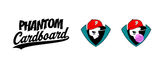
While he was at it I also had him expand the logo into a full mascot character.  He got that 100% how I requested too.  Thus Jackie Stalegum was born.  "Jackie" a tribute to Jackie Robinson with the last name being a homage to Topps’ pink brittle premium at the bottom of a wax pack.  I think Jackie has a fun Scooby-Doo villain vibe to him.  I got the idea to add a cape to the presentation from an old Batman card.
1966 Topps Batman B Series

Matthew ran a few color schemes past me.  The one I went with was the one that closely matched my vision mixed with his suggestion for the cape’s outer color.  The color’s a little more towards teal where I had it a dark green which came off a bit Christmasy.

This rookie card was always one thing I wanted to do with the design.  I also want to eventually use it clothing items but that’s something I’m really quite ignorant about so it’s on the back burner until I do a little more fact finding.  So, why did this card take two years?  Basically, I have not been able to take my attention away from the custom cards I make to devote time to creating this particular PCb. brand card.

Finally I just decided I’ve been sitting on this illustration for long enough and I wanted to make this a card.

my little slugger
I considered a number of different templates but decided to go with the one that started it all for me, the 1985 Topps baseball inspired design.  In 2015 I was just messing around with my daughter’s little league pictures trying to make her a custom baseball card.   That came out decent so I did it again this time with my other daughter’s cheerleading picture.  I don't have a formal graphic design background but I’ve always been a creative type and these cards give me a great outlet for that side of me.  From my daughters’ two cards it has snowballed into, hell, I don’t even know how many custom cards I’ve made to date.  As when I collected cards growing up, I never stopped to count, just always wanted more.  Trading cards have been a constant in my life as far back as I can remember.  They’re something I’m sure I’ll always have a love for because I can use them at markers to simpler times.  So many great memories for me can be tied to collecting cards.

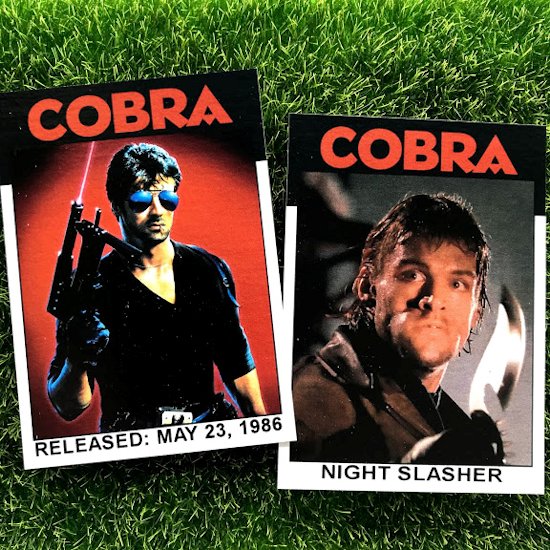
At first I was just recycling the ‘85 design and using it to make cards of all the things I wish had been made into trading cards when I was growing up. The design was easily customizable.  I would sometimes leave the team name nameplate blank because I thought it would make for a cool autograph box when I sent my customs out in hopes of getting them signed by celeb types.  From there I would experiment with other designs wanting to match the year of what I was making a card for to a card design produced from the same year.  I just like tying those two things together.  It makes the cards more “real” to me.

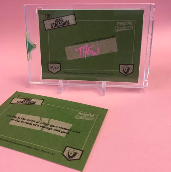
Jackie’s card originally had "Phantom Cardboard" inside of the team name nameplate, but then it dawned on me that that rectangle kind of resembles a wax pack gum stick.  That is my favorite part of the card.  Well, that and of course Matthew’s gnarly design.

After making my daughter’s cards my sole reason for making my custom cards initially was to see if I could get them autographed through-the-mail.  It became a fun little nerdy hobby for me.  So I thought what about this Stalegum card coming full circle with that 1985 design and an autograph?  While corresponding back and forth with Matthew about another project I asked if he’d mind signing a few of these cards for me to offer in a Jackie Stalegum RC Phan Pack to which he graciously obliged.

Now I that I had the Phan Pack’s centerpiece I wanted to surround it by some rad Jackie Stalegum swag.

So, without further long-windedness here’s what’s included in the aforementioned Phan Pack:


  • Jackie Stalegum autographed rookie card.  This card has a glossier “Tiffany” finish and is sealed in a 55 pt. Ultra Pro one-touch case.  The backside is signed by Matthew Skiff in Stalegum Pink and limited to 12 hand-numbered copies.
  • Jackie Stalegum regular rookie card.  Standard vintage finish, limited to 50 hand-numbered copies.

  • 1.5" vintage yellow pin
  • 2.25" Trapper Keeper Jackie pin


  • Holographic bubble sticker
  • 2” mini sticker
  • 2” mini magnet


  • Stalegum Pink PCb. school store pencil 


.


Monday, May 27, 2019

Happy Memorial Day


On April 25th, 1976 during the fourth inning of a game between the Dodgers and the Cubs two protesters jumped the left-field fence and ran onto the Dodger Stadium outfield.  Their intention was to burn the American flag right there in the outfield.  They got as far as dousing it with lighter fluid and striking two matches, the first blowing out in the wind.  The second was being stuck as Cubs’ center fielder Rick Monday, a former Marine Reserve, ran by and scooped up the flag.  Major League Baseball is a historic American institution and that series of events is one of the game’s most significant moments.

Rick Monday played 19 season in the majors.  He was a two-time all-star and member of the Dodgers 1981 World Series championship team.  Despite that, this one act is what he’s most remembered for but in interviews he’s done through the years he always says he’s totally fine with that.

This card of course is in the style of the 1976 Topps set.  This particular design in the Topps set was used as a part of their traded set.  I thought the newspaper headline motif would lend itself great to this card commemorating a very newsworthy event.

Thursday, May 23, 2019

Crime Is A Disease


If you've been me for while you'll know Sylvester Stallone is one of my favorites.  I don't know if there's a Stallone movie I don't enjoy.  Cobra is certainly not an exception.  It's a perfect example of an over-the-top 80's action movie, lots of violence with Stallone playing something of a renegade human terminator cop.  I remember as a kid the "Night Slasher" character really freaking me out.

This 4 card mini-set is done of the 1986 Topps baseball design as Cobra was released on this day in 1986.


Wednesday, May 22, 2019

Ace Ventura


Here's a card based on Ace Ventura's undercover persona, "Larry" he used to get into the Shady Acres Mental Hospital in order to get information on Ray Finkle.  Larry could probably best be described as suffering from PTSD from years of football head trauma.

For the card I wanted something kind of generic looking football card.  It couldn't include a logo and  I didn't want not having a last name to be too distracting.  I went with a 1974 Topps football inspired design.  I've only used this template one other time for a commission of an NFL football player to supplement the commission seeker's 1974 set.  I also liked this design for this card because the uprights clearly let you know it's a football design.

During the Larry scenes Jim Carrey pantomimes a number of different positions but he's a linebacker on this card because of Larry being in the three-point-stance.

This card also makes a really fun compliment to my Ray Finkle card.


Tuesday, May 14, 2019

Three For The Office


I was a little bummed that I couldn't have added Stanley "Secret Weapon" Hudson to my "Scanton Hoops" mini-set.  The orientation of the image just wouldn't work with the 1980-81 Topps basketball layout.  I still wanted to make a card for Stanley so I decided to put it into a 1989-90 Fleer basketball inspired template.  I chose that particular  basketball design because I liked the idea of putting "Secret Weapon" under the border curl.

While I was making this card a couple other fun trading card ideas for The Office came to mind.  I'm surprised it took me this long to make a "Prison Mike" card.  That one skit is probably my favorite of the entire series.  I've certainly watched those four-and-a-half minutes more than any other scene. For this card I went to maybe my favorite template to use, the 1984 Topps baseball inspired design.  I love the vertical lettering and the inset head shot in the corner.  Classic stuff.  Making this card, for whatever reason, also gave me an inspiration to make an Andy Bernard card.  He went to Cornell ya know, ever heard of it?  I chose again to use the same 1984 design as with the "Prison Mike" card.


Friday, May 3, 2019

Beasties

This picture of the Beastie Boys was on the cover of Rolling Stone magazine back in 1998. I still had Rolling Stone subscription back then and I remember thinking it was a very cool cover. This was the August issue right after the release of Hello Nasty which was an absolute monster when I was in high school.
a

 The retro look of this shot gave me a chance to recreate a funky ‘70s Topps design. After a little debate I went with a 1976-77 inspired design. The one big difference is the size. This card measure the standard trading card size; 2 ½” x 3 ½”. Whereas the 1976-77 Topps basketball tipped the scale at 3 ⅛” x 4 ¼”. I think that’s the biggest season set Topps made for any sport. Why did they make then that big? Not sure, maybe being cheeky with the fact that most basketball players are tall? I made it standard size because whenever I had any kind of oversized card they’d always get dinged up as they stuck out when put with normal size cards in your card binder or it an box or stack of cards.