Wednesday, November 25, 2020

Clue


I've made a couple of Clue the movie cards characters cards just for my personal collection for autographs.  I thought a custom gaming card would make for a really unique trading card to have autographed, which I was successful with on 3 of the 4 I attempted.  I've now decided to just go ahead and make a custom card set out of them as Clue is a pretty beloved '80s movie with a great cast.

There's a number different card designs since the game was originally released back in 1949.  I chose to go with a design inspired by the look of cards released with the 1972 edition of the game because they are the ones I remember growing up.

The set is 13 cards.  A title card and 12 character cards.  The cards all have the same back to stay with the theme of being cards from a board game.


Wednesday, November 18, 2020

Rachel Hunter

If you're talking a who's-who of elite '80s goddesses then you must include Rachel Hunter to the pantheon of unimaginably unattainable super hotties.  

With the addition of Rachel to the 1991 Score baseball Dream Team inspired Dream Girls lineup it completes the iconic 1994 Sports Illustrated Swimsuit "Dream Team" cover alongside Kathy Ireland and Elle Macpherson.  


Tuesday, November 17, 2020

The Shockmaster

For any of you that might not know who The Shockmaster is, he's an extremely short-lived World Championship Wrestling character of great infamy.  In 1993 at WCW's Clash of the Champions Pay-Per-View event the promotion was debuting a new character... live.  

Fred Ottman (formerly Tugboat/Typhoon in the WWF) was set to make a dramatic debut as the mystery partner for Sting and The British Bulldog.  The plan was to have him bust through a wall with pyrotechnics going off and then do a little spiel about an upcoming Pay-Per-View.  What happened was Ottman busted the wall from his waist up and when he tried to come through it the unbroken bottom half turned him into a human teeter-totter upending him onto the floor and causing is glitter covered Storm Trooper helmet to fall of and start rolling away from him.  It was such an over-the-top botch that off camera you could hear the other wrestlers break character and laugh at something that was originally intended to be an intense confrontation.  

Obviously whatever credibility the character would have had rolled away in that glitter-glued helmet, and the gimmick was essentially D.O.A. I have read that in the years since Ottman has been able to have fun with the whole thing, which is good to hear because I could see it really getting the best of some of those guys back then who really lived their gimmicks.  

With the Shockmaster's standout adornment being a glittery Stormtrooper helmet there's only one right answer for a custom card, that being the iconic 1977 Topps Star Wars design.  I thought the blue starfield border would be the cheekiest choice for The Shockamster.


Monday, November 9, 2020

Mr. Miyagi

In my never ending quest to leave no Karate Kid custom card stone unturned, I present to you Mr. Miyagi's 1984 Donruss style baseball card.

This is the first card I'll have made using the a 1984 Donruss style design.  This card plays up Mr. Miyagi being in full catcher gear while training Daniel-San on the art of the punch in the original Karate Kid movie.  Now that we know Mr. Miyagi's actual first name as "Nariyoshi" -thanks to the Cobra Kai series translating it from Japanese written form in The Karate Kid Part II and then used on Miyagi's headstone in the Cobra Kai series- I was able to incorporate that on this card instead of just his "Mr." moniker. 


Then came the card back.  I did a little research on the Miyagi character so the card bio area of the card got the richness that Mr. Miyagi deserves. 

I'm real happy with how this one turned out and excited to add it to all the other Karate Kid customs I've made.  


Tuesday, November 3, 2020

Blink 182's First Date Video


I'm not sure why, but one day I got on a binge watch of late '90s into early '00s alternative rock videos.  Music, for me, has always been a way to bookmark years.  Most times, almost a little Rain Man-ish, I can tell you the exact year a song came out.  The songs I was listening to took me back to my late teens and early 20's.  I guess I do the same thing with cards but that stops around the mid '90s because that's when I stopped collecting, so I'm unable to connect a card design to a year.  Music gives me a broader timeline in which to recall the who/what/whens of my life.

One video I've always liked was Blink-182's "First Date" off of their 2001 Take Off Your Pants and Jacket.  Actually, I like the video but I don't much care for the song.  I like that video because it's funny.  I always like videos that have 'rock stars' who aren't taking themselves super serious.  Set in 1974, Blink plays this sort of immature slacker El Segundo, CA garage band.  The concept stemmed from Tom DeLonge's (whom also "Fist Date") reaction to an over-the-top Bee Gees documentary where he recounted them "on top of a mountain, singing face to face, with the sunset behind them".

I thought it would be funny to make a card from this video with a 1974 Topps baseball inspired design.  I did a mash-up of a horizontal base card and a multi-play rookies card. 
1974 Topps baseball

The information on the back came from the end of video where they did a Fast Times at Ridgemont High style still frame of each member catching you up on what they've been up to since the events of the video.  There's three characters in the video, but obviously DeLonge's "Boomer" is the star.  A  random thought though... DeLonge was "Boomer", Mark Hoppus was "Spaulding" but Travis Barker is just..."Travis"?


Saturday, October 31, 2020

Night Of The Creeps


I started on this set and then paused thinking I had plenty of time to finish it up and put it out before the month was out.  Then, before you know it, it was down to the wire if I wanted to get it out in the month of October because here we are on the last day of the month.  It's pretty cool that it's a horror set on Halloween though, right?

Night of the Creeps is ripe for a custom card set.  Zombies, in my opinion, always make for a cool visual.  Plus, you've got aliens, flamethrowers, a boy-gets-girl story and the combination of Tom Atkinson and Dick Miller.  A little of everything.  That was the intention I guess. This was Fred Dekker's first movie and I read where his thinking was that there was no guarantee that he'd ever get another movie so he threw in everything he loved about movies growing up.  But, the movie doesn't feel incongruent because of that, he and Shane Black did a great job of writing it so that all the pieces fit together.  

When I was thinking about doing this movie as a card set I was all set of the 1986 Donruss inspired design.  That one always seems to be a crowd pleaser and I thought it would work well.  But when I was looking at the poster art for the movie that I like to use for my card set's title card I noticed how the zombie figure breaking through the door glass reminded me, shape-wise, of a template I used for another 1986 movie, my Link set.  The story behind the design is that I couldn't see the Link set going into a design that was originally used as a sports card design so I threw together a hybrid of the 1979 Topps Incredible Hulk set and their '84 Gremlins set.  It's essentially the same design in two different colorways and a Gizmo inset on the Gremlins cards.  I chose the light blue color from the Night of the Creeps movie title screen logo.

I didn't have a set number of cards the set was going to be.  I just sort of let the images I found online be the guide.  Depending on the quality/quantity of images I found it would either be the best scenes, which I knew had to include some of the cool special effects, or I might even be able to somewhat storyboard the movie with the cards.  It turned out the latter with the set totaling 21 cards.  That was really the scenario I was pulling for even if it meant more work.

The back design is a play off of the card front design, just like the Link set.  I threw in a couple fun elements to jazz it up a bit and make it distinctly Night of the Creeps.  The backs feature and cast title card, a quote card back, a trivia quiz card back, 4 character profile card backs and 15 movie fact card backs.

Since this is a larger set I wanted to include something extra for any fans that wanted to add it to their collection.  So, I came up with a "Zombie Bradster" pin that pulled from the card design.  This is a 1.25" round acrylic pin back pin that comes on a card set matching card back.  Truth be told after the set was completed I felt like I missed the boat on a janitor Miner "screaming like banshees!" card, so I made up for it, even if there is a pin hole in the middle of his face.


Wednesday, October 28, 2020

Elle Macpherson


The newest addition to the 1991 Score Dream Team inspired Dream Girls set is none other than the legendary Australian supermodel, Elle Macpherson.  Being on the cover of a record five Sports Illustrated Swimsuit Issues I would think puts Elle on the Mt. Rushmore of supermodels.


Wednesday, October 21, 2020

Jutta Leerdam

I recently became aware of Danish speed skated Jutta Leerdam through the magic of Instagram's explore tab.  Jutta is an accomplished speed skater with a great look.  I'm not sure if speed skaters ever get their own trading cards so I decided to pick up the slack.  Being that speed skating happens on ice I thought it would be most natural to get Jutta into a hockey design, bringing me to pair her with a 1990-91 Upper Deck inspired design. 


Monday, October 19, 2020

Sean Kanan


This is the third post in a row where I say I don't like going back to cards I've made in the past and modifying them and then showing off a modified version of one of my older cards.  Unless something comes up, this is the last one.  

As most of the readers know by now the Karate Kid trilogy is my shit.  I even heard rumors that there was a 4th installment and a remake, but I don't believe that.  The Cobra Kai series is pretty bitchin' though ;)  Back to the trilogy ... I love all three of those movies.  The 1984 original is my favorite, but I would have to say that I've seen the third one the most due to its heavy rotation in the early '90s HBO lineup.

You can imagine my excitement when I was asked by Sean Kanan - a.k.a "Karate's Bad Boy, Mike Barnes"- to provide some cards for an Instagram signing event he was doing for fans.  He had seen the Mike Barnes card I made back in 2016 based on the 1989 Topps baseball design and inquired about using it for the signing.  

I had paired that Mike Barnes card with John Kreese and Terry Silver cards and have been offering it as a 3 card mini-set.  I wanted to change the card somewhat to make it different from the card in that set.  The reason is I want to maintain the integrity of the Mike Barnes cards that are out there and sequentially numbered to 50.  I believe in that numbering and I want others to as well.  If I would have made up the remaining /50 inventory for Sean than that would have put an end to the mini-set.  So, I made slight changes to make it different.

I removed the "Karate's Bad Boy" sash that was in the upper left and I added a small PCb. logo.  The most significant change however came in the form of a card back that resembled the '89 Topps, instead of the stamped back you get with the 3 card mini-set.


Friday, October 16, 2020

Whoooaaa Bundy II

Like I went into explaining in my last post, I like to leave cards alone once they're done... but, here is another exception to that rule.

I was contacted about doing an Al Bundy football card for a private signing.  Since I'd already made an Al Bundy football card some time back I suggested using that one.  That card was agreed upon but the requester wanted a card back.  Since the card was made in 2018 when I was just using my logo stamped back, it did not have its own unique reverse.  My philosophy was for the longest time that it was all about the card's front side.  That was especially true for the fact that I was originally making these cards exclusively for myself in an effort to see if I could get them autographed.  Once you've got the card autographed who the hell cares what's on back, right?  Well, I've come to see the error of my ways and I've realized that a custom card's back can nearly have a much charm as the card's front if given equal time and thought.  

So, I agreed to do a back for this card.  Just because, I looked to see if perhaps there were any usable Al Bundy football pics I might have missed the first time around.  I knew I was going to use the same 1966 Topps football inspired design (four touchdowns in the '66 championship game, baby!) but I was wanting to remix this card a bit for this requester's private signing.  Low and behold I found an image that I dare say is as good, if not better with this card.  

1966 Topps football

After completing the back I pretty much fell in love with this card.  I actually didn't want to put it out there because I didn't want to, in a sense, kill the original Al football card.  But, I guess they both have to exist because basically I just really like the way this came out.  I think that all of us that grew up with Al "Touchdown" Bundy can appreciate yet another custom of this legend. 


Monday, October 12, 2020

Jose Canseco Would Be Proud


I've always maintained that my cards are both entertainment and a creative outlet for myself, and that even if no one else dug them I'd still be goofing around with them for myself.  The fact that there's also a little audience of collectors that are into the same stuff as I am is something that is not lost on me for one second.  It's particularly exciting for me when occasionally a subject of my cards gives me an attaboy. That was the case when the legendary Gerald Okamura saw my Big Trouble in Little China cards on Instagram

I'm honored to say Mr. Okamura really got a kick out of the Big Trouble set.  He's a really, REALLY cool guy, and he has a really big soft spot for those in the fan community still carrying a torch for Big Trouble.  

Big Trouble is such a visual treat of a movie, so it was really fun making a custom card set for it.  If the movie was handled by the studio correctly in 1986 I believe it would have had an official card release.  Luckily, for me anyways, they dropped the ball on marketing this film.  

I wanted to be as inclusive as I could with this card set and it ended making the set massive by PCb. standards.  The card set ended up being 38 cards.  I decided to split the cards into Series 1 and 2 in an effort not to overwhelm fans of the movie.  

The first message from Mr. Okamura was him inquiring about his cards in the set.  I was eager to send him the image of the card/cards featuring him in the set.  To my surprise (and embarrassment) I didn't have anything of his Wing Kong "Golden Six Shooters" character, nor any Wing Kong cards for that matter.  Now, I don't normally go back to a card set and add to or improve on it.  There's a couple reasons for that.  The first reason is that my cards have been ever evolving since I started doing this in 2015.  I look at them as time capsules to where I was artistically at that point in time.  So, the Big Trouble set  was the best of me in June of 2019.  If I were making the set today each card would have its own unique card back like my cards do now.  The second reason is that I don't think it would be fair to anyone who has added these cards to their personal collection to have me, in theory, "improve" on something and they still have the 1.0 version and anyone who purchases it after gets the 2.0.  But, even with that reasoning I just couldn't let this glaring omission stand.

I wanted to gift Mr. Okamura with a complete set that included a card with his character.  I got a cool Wing Kong image that includes Mr. Okamura and another henchman favorite, Al Leong. I kept everything the same so this card could slide in nicely to the Series 1 set. 

Photo courtesy of Gerald Okamura


When talking to Mr. Okamura about the cards I mentioned to him that they're designed to take after the 1986 Donruss baseball cards to coincide with the release year of the movie.  Just kind of explaining why the cards look the way they do.  Without missing a beat Mr. Okamura replied "Jose Canseco would be proud".  That blew me away.  I guess I just didn't expect him to comeback with that card knowledge.  For anyone that didn't grow up trading card obsessed, the 1986 Donruss set is most notable for the extremely sought after short-printed Jose Canseco rookie card that saw the future 40/40 man rocking what can most accurately be described as a "dirt 'stache".  I was so tickled by Mr. Okamura's compliment that I asked him to autograph my personal copy of the card with that inscription, which he so graciously obliged.  That card will never leave my collection.  I might even request to be buried with it ;)

Now, I honestly don't think many read my blog posts.  Not that that's a bad thing.  I just do a little write up with new cards to give a little insight to my thoughts when deciding how the cards will look.  But, in the event that you're reading this and you've added Series 1 to your collection, don't worry, I've got you covered and your card is on the way.  If you've picked up Series 1 and 2 then you've got the new card and the special Gerald Okamura auto card coming your way.  Thirdly, if you've got Series 1 already and add Series 2 at any point the Gerald Okamura card will be included.

Wednesday, October 7, 2020

Karate Kid Halloween


It's been awhile since I've done a Karate Kid card, so I was kind of jones'n. I've also been thinking all year about doing some limited Halloween themed cards.  The problem with that is that I procrastinated thinking month-by-month that "ahh, I've got plenty of time".  Well, here we are in October.  Oh, well.  Maybe next year.

The Halloween dance scene is a favorite of mine and many Karate Kid fans alike.  Johnny and the Cobra Kai's skeleton costumes are a pretty bad ass look and you've got the clever shower costume engineered by Mr. Miyagi at the last moment.  The part where Johnny and the Cobra Kai catch up to Daniel is really important as it brings Mr. Miyagi into the conflict.

This card is based on the 1984 Topps baseball set with some obvious liberties taken to achieve a more Halloweenish look.  

1984 Topps

The timing of this card is pretty good as well with the trailer for the third season of Cobra Kai have just been released that will surely keep all of us fans buzzing until January when it finally comes out.

This card is a special limited release.  I've dialed the print run back to 31 from the normal 50 and it will be retired at midnight on October 31st.


Friday, October 2, 2020

License To Drive


When you talk about quintessentially '80s movies I have to believe License to Drive makes the short lists, especially when talking about teen comedies. It's got everything you need.  The look, the music and the Coreys at the height of "Corey Mania".  

In doing my research for the card set I watched a number of interviews both from when the movie was released and years later that had the actors looking back on the experience.  It made me a bit sad because it really did seem like Corey Haim was a sweet person who was chewed up and spit out but the dark side of Hollywood.  License to Drive was Heather Graham's first big movie and Corey Feldman, thankfully, was able to resist doing Michael Jackson dance moves in the film.


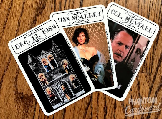
I've had this movie in mind as a card set for awhile but couldn't quite pair it to a vintage inspired trading card design that I thought would lend well to it.  The reason I like to use trading card designs that match the year of the movie's release is it gives you a mental place marker for when the movie was out.  License to Drive SHOULD have had a proper trading card release, but it didn't.  So, rather than guess at what a 1988 design for a License to Drive trading card set *might* have looked like I framed it in a card design that *did* come out that year.  I just feel it adds a bit more of a authenticity to the set. 

1988-89 Fleer

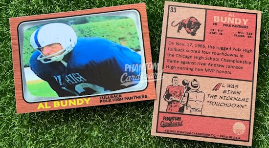
The design I landed on was 1988-89 Fleer basketball.  It's really nostalgic for me personally because I was heavy into basketball cards at the time. There are some baseball set that, while they may be more recognizable, didn't give me the same creative "fit" as I pictured with this Fleer design.  

Once I settled on a design it was almost overwhelming with all the possibilities that I was thinking could be with an automotive theme.  Eventually I pictured something that could marry the '88-'89's design while incorporating some automotive elements and at the same time not going overboard.

For the card front I incorporated some of the colors that are found on the movies' logo.  Just as a side note, I noticed that the License to Drive logo used the same color pallet as the classic MTV logo.  That's a genius subliminal.  A correlation to MTV, especially in 1988 when it was still a music video channel the way our forefathers intended, would be a perfect marketing fit for this movie's target audience.  Even though the font style of the '88-'89 Fleer is pretty irregular I kept it for the card's captions to really give the eye something to volley the set's original look to this movie adaptation look.  The tire tracks in place of the gradient that was on the side of the Fleer is another attempt to give the cards a License to Drive theme while maintaining the spirit of the original design.  


Some of the images I was finding just wouldn't work well put into a vertical layout , you'd lose a lot, so I went ahead and also made a horizontal template too.  It was a bit of a pain because at that point I was eager to get on with the fun part of making the actual cards, but it was something that I felt needed to be done.  It's a little extra that was definitely worth it. 

The card backs is where I started to freestyle.  I just couldn't see it being a fun card back with mimicking the backs of the original cards.  I had a bunch of different ideas but then it sort of hit me that a license plate would be an absolutely perfect creative complement. It's a California plate, the same style plate that was used on Les' Grandpa's Cadillac.  The tabs were perfect for use as the sequential numbering spot and card numbers.  In addition, the font is a license plate style lettering. 


This set ended up being 22 total cards.  For the backs I was thinking of doing some storyboard synopsis to the scene on the front, but then I reasoned someone who would want this set is going to be familiar with the movie.  Stuff like quotes and little known facts and trivia are the type of stuff I'm into, so that's what you get on the backs of this set.  The first card in the set is a title card, so it's got the cast listed on the card back.  Then you've got 4 character profile backs, 1 quote back, 14 film fact backs and 3 trivia backs.


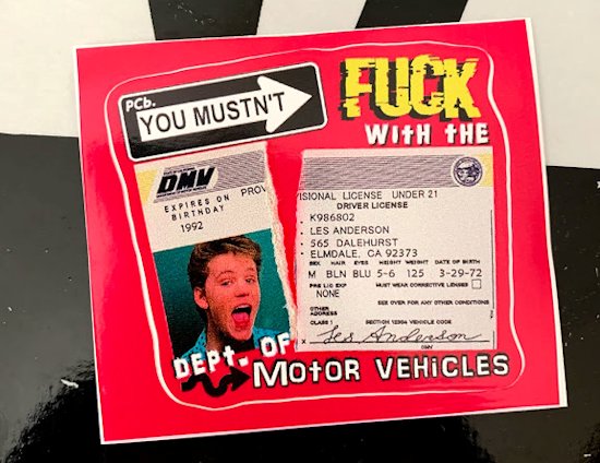
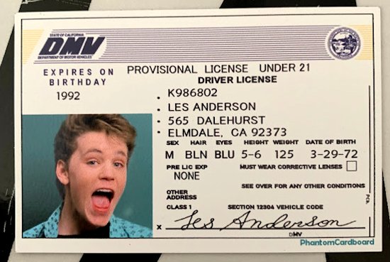
Awhile back I made a movie accurate Les Anderson driver's license.  I wanted to incorporate it somehow.  What I came up with is a die cut sticker (approx. 3" x 2.5") that comes with the set.