Wednesday, November 23, 2022

Paige Spiranac Card Dump

Although I haven't been posting them, I've been making Paige Spiranac cards and setting them aside over the last few years.  I'll save images and sort of use them as custom card practice.  I've decided to now post all of the Paige cards I've made so far.  The first two are inspired by the 1989 and 1991 Upper Deck baseball designs respectively.  
Inspired by: 1990 & 1992 UD baseball

Inspired by 1993-94 UD basketball / 1989-90 NBA Hoops

Inspired by 1991 UD football / 1988 Topps football

Inspired by: 1992-93 McDonald's UD basketball / 1991 UD football

Inspired by: 1985 Topps First Blood Part II / 1986 Topps baseball

I think this one, inspired by the 1991-92 Skybox basketball set, is my favorite of the lot.  It's such a clean look.  This is one I'd love to one day have signed.
Here's two bonus cards that I made early on and was able get signed.  The first is inspired by the 1987 Topps baseball design and the one on the right is just an autograph card design I came up with.  Paige was pretty good at signing through the mail but as her popularity has grown I'm assuming it's harder for her to keep up with it, which is understandable.


Thursday, November 3, 2022

Sig. Showcase: Rose Namajunas

With my cards, the bulk majority of what sparks my interest is creating cards that are vintage inspired.  The idea is creating cards that look like they could have existed back in time.  I don't go too far past the early '90s, when the companies really started to modernize in their card's presentation with newer technologies.  That was exciting, but for me the passion and artistry is in the older, more dated card designs.  It's all about the nostalgia.

Occasionally I do dabble with designs that are original and a tad more modern looking.  These cards are typically cards I'm making for myself in hopes of getting them autographed.  When doing so I typically draw inspiration from designs from Upper Deck or Topps, not so much Panini -- I find their cards, design-wise, to be bland, boring and redundant.  

I got an idea for a Rose Namajunas card.  I wouldn't consider myself an MMA "junkie", but I am a fan of "Thug Rose" and wanted to create a card in hopes of getting her autograph.  I love Rose's whole demeanor and humility.  I also really like how that humility and her appearance really belies her skill level.  She's an absolute warrior. 

So, I set out to make a card that would have a little more modern appeal as MMA didn't even exist in the time period that most of my cards are designed to emulate. I started by looking for an image that caught my eye.  I knew a good way to achieve and more modern look would be to have the image full-bleed, meaning no border framing the card.  I made the image black-and-white as it helps a would-be autograph "pop".  From there I added some subtle touches that helped identify it as an MMA card, but as to not distract from the image.  I really am happy with the end result and even happier to have it come back to me signed. 


Saturday, October 29, 2022

Frankenhooker

This 50 card set is the custom set I referenced as a "passion project" back in this post.  I began tinkering on this set at the end of June.  A combination of things; it being a 50 card set and a couple of printing setbacks, stretched this one out for months.  There was no rush because I make these for fun.  I didn't give myself a deadline, so the proximity to Halloween is a ghoulish coincidence.


At 50 cards (52 if you count the promo card and special "Dream Ghoul" card) this is the largest card set I've done.  I learned a lot, most specifically that I'll never do a set this large again. It's just too much for my one-man Mickey Mouse operation.

This set came to be thanks to my son and his repeated viewings of the Blu-ray, which eventually I had to hide.  I can't recall if I've mentioned it on other blog posts -probably not, I try to keep it about the cards- but, my son is on the spectrum.  He's non-verbal, so movies are a form of communication and bonding for he and I.  The only issue is that when he likes a movie he can't just watch it once, or even two or three times.  It's back-to-back-to-back for days or weeks or sometimes months.  He's done the same thing with Cliff Hanger, Total Recall, The Running Man, Return of the Living Dead Part 3, Suspiria,  among other movies.  He gravitates towards the intense action scenes.  


I decided to make a set from Frankenhooker because the more times I watched this quirky movie, the more I fell in love with it.  I've always been fond of the film, but I really started to deeply appreciate the performances, the aesthetic and story.  It's crazy to me that the idea for the movie was originally an on-the-spot ad lib by director Frank Henenlotter after another of his more thought-out movie concepts was shot down by his would-be producer.  

Another pseudo-factor in liking Frankenhooker is that it's an adaptation of Mary Shelley's Frankenstein.  It seems everyone has their favorite Marvel and DC characters (Incredible Hulk and Plastic-Man, respectively) but I'd also be interested to know other's favorite Universal Monster character.  Mine has always been Frankenstein.  


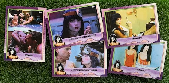
Horror movies (or horror comedies in this movie's case) are my favorite to make sets from.  I just really like the special effects visuals.  Monsters are just fun to create a vintage inspired custom cards out of.  That's also how this set ended up being 50 cards.  By the 87th -give or take- viewing I loved so much about the movie that I wanted to include as much of it as I possibly could.  I wanted the card set to follow the sequence of the movie and present nicely that way in a binder.

I considered a few different card sets looks from 1990, but I felt that a template inspired by the 1990 Topps baseball design would work out best to give these cards a look unique to the movie but still recognizable as a classic Topps design.  Plus, the '90 Topps frames was purple after all... "I'm looking for a tall purple girl.  She's got a black forearm and fresh stitches".  I also wanted a design that would lend well to using captions as is the case with non-sports card sets.  That might have been my favorite part, coming up with the double entendre puns.


The same approach was taken for the card backs.  I wanted them to resemble the '90 Topps with some Frankenhooker flair.  I watched the movie scene-by-scene pausing to get exact quotes for use on the card backs.  There's a few scenes that did not have dialog so those 4 (I believe) cards have movie trivia questions on them.  I also wanted to give each card a fun fact because I personally place great importance on that type of shit of zero consequence, rather than figure out how things like stocks or mortgages work.  It's not enough to like a movie.  I need to be able to annoy others with "did you know?" type information that they couldn't really care less about. 

Pretzels GOOOD

The set ended up being 48 cards, which with being that close to 50 didn't sit quite right with me.  So, I made two checklists which is ironic because I'm not planning on parting specific cards from the rest, so if you have the checklists, you have the rest of the set.  But, it gave me an excuse to use a couple cool behind-the-scenes shots that otherwise didn't have sequential story context.  Which begs the question of why didn't I just just cap the set with a couple of behind-the-scenes cards instead of checklists?  That is a pretty good question actually.  I don't know.  It's just what I did.  Consider it just a homage to set collecting where the checklist let you know which cards you needed to complete a set, like back in 1990.

The Dream "Ghoul" card is a play on the Dream Girl cards I do, which of course are a play on the Dream Team subset from the 1991 Score baseball set.  In the time it has taken to produce this set I've plugged upwards of 20 or more images into the Dream Girl template.  Patty Mullen was such a babe and a brilliant choice to play Elizabeth as she had a great look (1988 Penthouse Pet of the Year) and had the comedic chops to soften a character that is essentially a prostitute monstrosity. 

I also made a promo card for the hell of it.  In the early '90s I remember promo cards really coming into vouge, especially with non-sport card sets.  I totally marked out to those oddball type of cards.  They were the epitome of rare and special to me.  You couldn't get them in packs.  Sometimes they were dealer exclusives or sometimes they'd be a magazine premium.  Either way, I was in awe of them, so I thought it'd be cool to recreate that with this set. 


Friday, October 21, 2022

Pizza The Hut And Vinnie

I was cleaning up my camera roll so my phone has enough storage to do an update and came across this card I made awhile back but never shared for some reason.

This of course is Pizza the Hut and Vinnie from 1987's Spaceballs.  Being that Spaceballs is a Star Wars spoof I did this faux sticker in the style of the stickers from Topps' 1980 Star Wars: The Empire Strikes Back -- specifically the Boba Fett / Storm Trooper sticker.

Wednesday, October 5, 2022

Fast Times 40th Anniversary

In August my favorite movie -one of them anyways-, Fast Times at Ridgemont High, celebrated its 40th anniversary.  Watching the movie once again made me want to pay a trading card tribute to it.  The only problem I've almost exhausted all ideas that make sense, but I was pretty dogged in the idea that I had at least another Fast Times card in me.  Turns out I had three.

I began thinking of the different card designs that were out in 1982, the year Fast Times was released in theaters.  I've used a number of the sports card designs on the movie, so I thought about non-sports options.  That's when I landed on the design for one of the biggest blockbusters of the 1980's, E.T.  I started out by making a Linda Barrett die-cut sticker insert.  I thought her iconic red bikini would popped with the red of the sticker border.  The design it self is pretty recognizable as it also used for the 1977 Topps Star Wars set stickers.  Then, because the only thing better than a new Phoebe Cates card is two new Phoebe Cates cards, I went ahead and made a card inspired by the E.T. base set design.  For this card I thought it would be fun to replace the E.T. silhouette with one of Linda Barrett the moment before she unhooks her top in Brad's fantasy.  For the card back I did another silhouette of that famous pool fantasy scene that ruined so many rental tape copies back in the day.  For S&G I also turned that graphic into a sticker because I just cannot help myself.


I had thought in the past of making a Brad Hamilton baseball card with him in his Cleveland Indians jersey.  I think the reason I held off  before was because the jersey is worn during kind of a touchy scene when Brad unknowingly gave his younger sister Stacy a ride to the abortion clinic.  For myself I can't really separate the jersey from the scene.  But, even so I thought it could still make for a good custom baseball card.  Since I used the '82 Topps design for the two series of Fast Times movie cards I wanted to use one of the designs from the other two major companies; Donruss or Fleer.  
Since, in my opinion, the 1982 Donruss design is completely horrendous it was going to be Fleer.  The 1982 Fleer baseball design is kind of generic looking but I think that also gives it charm and versatility.  On the back I used Brad's work resume in place of baseball stats and added a few Brad Hamilton highlights at the bottom.
It would have been nice to pair these with the Spicoli card I made back in July.  That card was one the few times I was able to time a card with a date being that I wanted to put it out around the Fourth of July.  I was more more disciplined in doing that these newest card would have been done around the time of the anniversary date, but having them out in the same year is good enough for me.

Wednesday, September 7, 2022

Paige Spiranac And The 2022 NFL Season Kick Off

I thought today would be a good day to post this new card with the 2022 NFL Season kicking off tomorrow, with the defending Super Bowl Champion Rams taking on the Bills.

Typically I don't put enough forethought into the cards I make to time them to dates of any certain significance.  I just make them when the inspiration hits me and post 'em up.  I've got a bunch of pictures saved that I eventually want to make custom cards out of.  This image of Paige Spiranac, a self professed Steelers die-hard, is one of those images.  I've had the picture in my "cards to-do" folder for quite awhile now, but I collect inspiration at a much greater pace than I make cards.  To even that out I'd never be able to get up from my desk and my work probably wouldn't consider that enough of a reason for calling off.  So, what I'm saying is that it's more of a coincidence that I'm posting a football card coinciding with the start of a new NFL season.

This card is inspired by the 1991 Upper Deck football set.  This is a design that has found a home with my cards.  It's clean and straight forward.  

Though I've only posted one other Paige Spiranac card here, I've actually made quite a few.  Since she's a sports personality I've stumbled upon numerous images that lend to custom card making.  I'll eventually get around to posting a collage or something of those on here.  

Wednesday, August 31, 2022

New Dream Girl Cards Wave 2


As was mentioned in the last post, I'm working my way through a backlog of new additions to the Dream Girl custom set.  Here is the second wave of six cards.  

I noted that there's a few of the girls in the new additions that'll be featured on two cards with my inability to chose one photo over the other.  This time around it was Emma Watson.  My cards, my rules ;) 

Friday, August 19, 2022

New Dream Girl Cards Wave 1

I've been working on a card set that I want to call a "passion project" but at the same time I do not want to call it that because that just sounds overly dramatic.  I like to keep the whole thing fun and not take it too seriously.  These are trading cards and not my "work" or my "art".  The cards give me an opportunity to be creative in an otherwise mundane existence.   I appreciate the humor in them more then anything, coupled with an outlet that can quell my OCD-like need to perfect custom trading card nuance.

So, while I've been plugging away at this card set *tease* I've been adding onto the ongoing Dream Girls set I've cultivated over the last couple of years. I'll see images from time-to-time that I feel would make great additions to this highly subjective series.  But, I haven't stopped long enough to make physical renditions and post them here.

I figured I better put a few of these out there before it gets out of hand.  As it stands there's 17 new DG cards all told.  With that many I've decided to post them in three waves, with this being the first.

Each of the three waves will feature one Dream Girl that has two versions.  Basically it happened that threes time I couldn't choose between two images, so I just didn't.

Wednesday, August 10, 2022

Mikayla Demaiter II

Upon completing the Michael Scott 1990-91 ProSet hockey inspired card I immediately wanted an excuse to use the template again.  The wait was not a long one having scrolled upon the image of everyone's favorite goalie turned model, Mikayla Demaiter.

Wednesday, August 3, 2022

Lola Marandel

Maybe a month or so I was just looking through some of the cards I've made over the years, just sort of scrolling through the folder.  I came to the cards I've done utilizing the 1992-93 Upper Deck McDonald's basketball inspired design.  I noticed that the three cards I've done using this template have all been volleyball cards so that got me interested in trying out a different sport whenever the opportunity presented itself.

I recently started following French professional tennis up-and-comer Lola Marandel on Instagram.  While scrolling through her feed I found a couple of pictures I felt would work well for a custom card.  

To give this card a tennis theme I switched out the hardwood bottom border for that of a clay tennis court and of course traded in the volleyball for a tennis ball.  I think my favorite thing about this card is the combination of colors.

Tuesday, August 2, 2022

Michael Scott Hockey Card

The Office is one of those gifts that keep on giving as far as me making some really fun custom cards.  This card is based on a Season 2 episode entitled "Michael's Birthday".  Kevin is waiting to hear back as to whether or not he has skin cancer which draws concern from his co-workers, much to the chagrin of the attention Michael feels should be paid to his birthday.  To shift the spotlight back on himself errr distract everyone from Kevin's impending prognosis Michael takes his crew to an ice skating rink for a skate party.  It should go without saying -because it's an episode of The Office- but it's a hilarious episode.

What's evidenced in the ice rink scene is that Steve Carell, in full hockey gear, is a very adept ice skater.  Growing up Steve was goalie and had aspirations at one time of a career in hockey, he even has an Elite Prospects page.  In the end Steve shifted his love of hockey over to a hobby to focus on a different career path.

Growing up I was not a big hockey fan because I didn't play hockey.  I've actually only ice skated once in my life.  Hockey is an expensive sport to get into and my family was a $5 Hot 'n' Ready family.  But I did collect hockey cards because... well ... they were cards.  The Red Wings were not dominant until I was in high school but it was still exciting to pull a Bob Probert, Sergei Federov or Stevie Y from a pack.

This card is done in the style of the 1990-91 ProSet hockey cards.  I remember buying a good number of packs of these at my local party store.  These were the first hockey cards from ProSet I believe.  ProSet was fun to collect because they were on trend with what was the newer look in sports cards back then.  They offered an alternative to Topps' traditional look.   White stock instead of cardboard, brighter colors and photography, less framed in and more full-bleed shinier photography and full color card backs, plastic packs as opposed to wax ... all things that could probably be credited to Upper Deck's influence on trading card aesthetics coming out of the 1980s and moving into the '90s. 

This is the second time I've used this particular template.  The first time was 4 years ago with this Sea Bass card.  My cards have evolved a lot since then.  The biggest difference is that back in 2018 I was only doing card fronts.  My thinking was that's what really counts anyways, but I've come to realize how much better a complete card presents.  It takes twice the time to finish a card but it's so worth it in the end.  Obviously still a custom, but less of a custom, if that makes sense.

Friday, July 29, 2022

Grumpy Cat

Back when Grumpy Cat, né Tardar Sauce, was taking over the interwebs I was there for it.  I'm probably what you'd call a "cat person" and I thought the memes were pretty damn funny.  I think my favorite was captioned "That shit better be fancy feast".  Whomever was behind the Grumpy Cat marketing machine did an excellent job as she was everywhere -yes, Grumpy Cat was a female- I even had an official Grumpy Cat t-shirt that I proudly wore as the antisocial that I am.

In 2015 Grumpy Cat, and Arizona native, "threw" out the ceremonial first pitch before and Diamondbacks / Padres game.  I like using the '86 Topps baseball inspired design for celebrity pitches.  If Grumpy Cat was still with us I'd hope she'd absolutely hate this card.

Friday, July 15, 2022

Sig. Showcase: Christie Brinkley

I just got these two cards back via a send-in from a private signing that Official Pix did with Christie Brinkley.  It was pretty much a no-brainer to participate in this signing.  Autograph + 80's icon is an automatic custom card-on for me.   

I've made 3 cards featuring Christie, one as a part of the ongoing Dream Girl set, and two within the Vacation set.  I chose the two pictured above to send in.  It was a toss up between the two Vacation cards.  The other is the iconic shot of Christie in the Ferrari, but I chose the hotel swimming pool scene card with the idea that the upper left corner left a lot of space to really showcase an autograph.

The Dream Girl card is the first of the sixteen "official" DG cards that I've gotten signed.  There's a few rouge Dream Girl cards out there however that were done as commissions that have been inked. 

Another thing that really appealed to me about this private signing was discovering upon some research how clean Christie's autograph is.  I was confident the cards would turn out great.  For Official Pix's part these two cards were signed exactly as I requested them to be, plus they put a nice holographic COA sticker on the back.  I'd highly recommend their service if you're an autograph collector.


Friday, July 1, 2022

Spicoli's Independence Day

I've been sitting on the idea for this card for quite a few years.  I think the reason it hasn't gotten done until now is that I wanted to time it with Independence Day and in years past the 4th of July has always snuck up on me and then it would be too late, so it would go on the backburner for a year at a time.  More recently I've mainly been working on autograph cards for my personal collection, so this time it was easier to take a break from that as opposed to being in the middle of creating a new mini-set and not wanting to pause from that.

Rack Pack Glossy all-star

The idea for this card was always to do it in the style of the old glossy rack pack all-star inserts.  Anyone who collected baseball cards in the '80s probably had a few of these in their collection.  These cards highlighted MLB all-stars from 1984 to 1991 with virtually no change to the design with the exception of updating the year at the top.  I chose this design for its 'all-American' appeal.

Fast Times at Ridgemont High is one of the 5 or so movies I consider to be my "favorite" because I just can't pick a clear winner, as I like different movies for different reason.  Fast Times, as well as The Karate Kid (another on that favorites list), are movies I've exhausted most any sensible trading card tie-ins for.  I particularly enjoy making cards for Jeff Spicoli and Linda Barrett with those two being my favorite male and female characters in the film.  I'm sure that's also true of most fans of the movie due to their respective magnetic scenes.   


The scene depicted on this card was foreshadowed on the first day of school - "Just like you wouldn't want me to come to your house some evening and discuss U.S. history with you on your time" - and is the third and final act in Mr. Hand and Jeff Spicoli's adversarial teacher/student relationship.  After having Mr. Hand's will imposed onto him in the first two acts Jeff was able to muster a little redemption with his recounting of the American Revolution in the most Spicoli way ever.  That summary of events of what led to the birth of a new nation I thought would be the perfect card back in a Constitution/Declaration of Independence style presentation. 

One element this card HAD to have was a reference to, in my opinion, one of the funniest lines in Fast Times when on the first day of school Jeff Spicoli, despite the totally confusing new schedule, reasons that he's found the his U.S. History class he's supposed to be in because he spots a globe in the back corner of the room - "This is U.S. History, I see the globe right there."  Dead giveaway, right?

Thursday, May 12, 2022

Gina Carano

Although I didn't have any cards made up of Gina Carano, I wanted to add her to me autographed custom card collection if given half a chance.  That chance came via a private signing with SWAU a couple of months back. This is the first time I've used their service and I have only good things to say.  They're very professional and their site allows you to keep up-to-date on the status of the signer you're waiting for.

The majority of cards I get signed are through the mail.  It's a bit of a gamble.  You never know what you'll get back, and I guess that's part of the fun.  But, occasionally I'll send into private signings.  With a private signing it's the opposite.  You now you're going to get a return every time, well, almost every time.  With a private signing you assume the role of paying customer so you pretty much get to have what you want, how you want it.  Whereas the other way you never really know if it'll be signed where you want it, if it'll be damaged or lost in the mail, if the signature will be smudged, etc.  Lots of variables.  I also like to not have my autographs personalized.  They're generally just for my private collection, I just don't like my name written on the card and you can specify that with a private signing whereas some celebs will automatically personalize to cut down on people selling their autographs.

So, when I saw the Gina signing being advertised I got to work on making a card.  I chose to go with a 1991-92 Skybox design which is a template I LOVE for autographing, but haven't had much success getting cards autographed when I've used it.  I actually collect official '91-'92 Skybox autographed basketball cards.  They cards have a helluva cool and clean aesthetic that lends so well to autographs because of all the white space.

The picture I chose came from Gina's 2009 ESPN Magazine "Body Issue" that was actually used for the magazine's cover. It's a pretty iconic picture for both Gina and the magazine.  

For the back of the card I used a weigh-in picture of Gina from her last professional MMA fight in 2009 vs. Cris Cyborg.  That fight is probably the single most important fight for pushing the envelope for women mixed martial artists.  I think that also made it obvious to everyone that Gina was a big-time box office draw and afforded her the opportunity to pivot into a big screen career pretty easily.

In looking for the right image for the Skybox-style card I came across other images that pained me to just leave on the cutting room floor, so I said "what the hell" and just made a second custom Gina Carano card for the signing.  

The design of the second is an original design of mine.  In my files I label this design as "horizontal split", pretty to the point.  I've done a number of cards with this template but, before this card, have had zero success on a return.  I usually use this design when I just cannot decide between two images so I just use them both.

I really dig that SWAU uses a holo-sticker with a QR code to easily verify autographs from their signings.  I like it for both the obvious reasons and also that it adds an 'official' look to my cards.  Hopefully they partner with 


Wednesday, April 27, 2022

New Dream Girl Trio

My card making production is a far cry from what it was during the Covid era of 2020-21.  Being back to in-person work has had a negative effect on my pace, but I still find time here and there to have some rectangular creative cardboard fun.

In this time I've fielded a number of inquiries about the Dream Girl series I'd been cultivating.  I guess I'm to assume it has a little bit of a following.  I can see the appeal.  Beautiful woman X a very memorable early '90s baseball card subset.  It's got the freshest ingredients.  

So, since it's been a hot minute I've decided to add not one, but THREE new additions to this ongoing set.  Halle Berry, Brooklyn Deck and Charlotte McKinney.  The latter two are carry overs of a boxing themed TKO! series I  had started that was kind of a predecessor to the Dream Girl set, and the Halle was a cutting room floor commission.

Tuesday, April 26, 2022

2022 Astronomicon Wrap Up

This past Sunday I took in the Astronomicon to get a few of my custom cards signed.  This was the 5th annual version of this particular convention, but my first one.  I just recently found out about it and was pretty impressed with the lineup, so I decided to check it out seeing as I have custom cards of a few of the celebrity guests that I wanted to add to my autograph collection.

First off, I thought the convention was well laid out and well organized.  I guess I expected a smaller scale than what I encountered.  It was first class all the way.

The three signers I keyed in on were Nick Castle from Halloween, Peter Dante from The Waterboy and Kevin Nash.  If you're new to my cards or this blog, this is where my genesis for making custom cards really came from, to be able to create cards of things that didn't exist that I wanted signed cards of - in a nutshell.

So, I took to the convention armed with special edition versions of the above three cards.


No complaints about the signers.  My interactions are typically brief because I really don't know what to say to these people.  I'm truly awkward and introverted, in a textbook sense and not in a 'I'm just so introverted' trendy meme sense.  I assume they know I'm a big fan since I'm waiting in a line in order to pay them money to write their name on something for me.  I get the autograph and get the hell out of there.  I leave the the schmoozing for the people in line behind me who actually understand how small talk works.

The only time I break from my signer protocol is if I'm asked about my cards.  Typically the signers really dig them.  I usually get a "I've never seen one of these, where did you get it?" type of responses, and that gives me an in where I don't have to feel like a weird tongue-tied fanboy.  Unfortunately that didn't happen this go 'round.  The only pop I got was from MI native Kevin Nash.  "Big Daddy Cool" remarked "whoa, blast from the past" when presented with my custom college basketball card of him.

I got a photo signed by Danielle Harris for my buddy that was under the weather and couldn't come with.  I've gotten her auto before via private send-in, I just mention this as a lead-in to an observation.  This was the first time I ever saw Danielle Harris in person and she's is definitely a small breed.  I'm thinking if I had brought a backpack I could've snuck her out in it.  Other than that she was very sweet to me and everyone else I saw her interact with.

Then there was Peter Dante...  Even though he didn't mark out to my Gee Grenouille card, the dude was definitely in the zone.  He had earlier purchased quite a few boxes of girl scout cookies from the scouts that had gotten a vendor table right across from where he was signing.  He was then passing them out to any and all in the vicinity.  He offered me a samoa cookie and my first inclination was to go with the "nah, I'm good" but then I thought this *is* El PresiDante giving me a cookie, plus he wasn't really wasn't taking no for an answer anyways.  I handed him the card to sign.  He got through "Pete" before stopping and legitimately trying to get to know me as a person.  Where I'm from, what I do for a living; the whole nine.  I gave him the info he wanted and we chatted for a moment about me and my state of professional affairs.  He then went ahead and added "Dante #12" and I thanked him.  But, even as I was walking away he continued to call out to me by name and hype me up like we were old buddies.  If the convention was a party, Peter Dante was easily the life of it.  I'll 100% get an autograph at all future conventions I attend that he's signing at.


Saturday, April 23, 2022

Nita Strauss Autograph Bummer

I sent this custom autograph card to VShout (whom I've gone through many times with great results, check them out) back in April of 2021 in anticipation of an autograph from a private signing that had scheduled with Nita Strauss.  

If you're unfamiliar with Nita, she's a guitar playing force of nature.  She's got a lot on her rock 'n' resume, but is probably best known for touring with Alice Cooper and absolutely killin' it.


I had the idea to make an autograph card that looked like an old cassette tape sleeve.  I felt like that would make for a really rad autograph card concept.  I even went as far to make a barcode, that when scanned, would read "Phantom Cardboard" - although, thinking about it now the autograph would have most likely obscured that.

This was taking forever, but I was REALLY excited about getting this card auto'd, so I was willing to be patient and wait.  Well, after a year of waiting I got the unfortunate news that Nita -probably due to a scheduling/touring conflict- had to cancel the private signing.  Needless to say I was pretty bummed out.  But, I got the card back and will hold onto it in hopes of another shot.