In August my favorite movie -one of them anyways-, Fast Times at Ridgemont High, celebrated its 40th anniversary. Watching the movie once again made me want to pay a trading card tribute to it. The only problem I've almost exhausted all ideas that make sense, but I was pretty dogged in the idea that I had at least another Fast Times card in me. Turns out I had three.
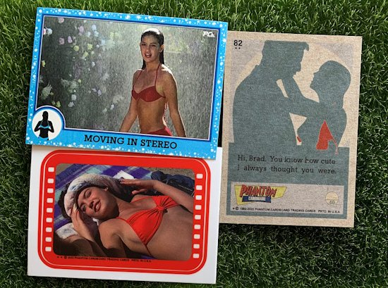
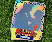
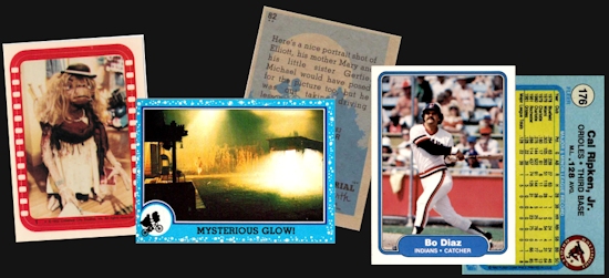
I began thinking of the different card designs that were out in 1982, the year Fast Times was released in theaters. I've used a number of the sports card designs on the movie, so I thought about non-sports options. That's when I landed on the design for one of the biggest blockbusters of the 1980's, E.T. I started out by making a Linda Barrett die-cut sticker insert. I thought her iconic red bikini would popped with the red of the sticker border. The design it self is pretty recognizable as it also used for the 1977 Topps Star Wars set stickers. Then, because the only thing better than a new Phoebe Cates card is two new Phoebe Cates cards, I went ahead and made a card inspired by the E.T. base set design. For this card I thought it would be fun to replace the E.T. silhouette with one of Linda Barrett the moment before she unhooks her top in Brad's fantasy. For the card back I did another silhouette of that famous pool fantasy scene that ruined so many rental tape copies back in the day. For S&G I also turned that graphic into a sticker because I just cannot help myself.
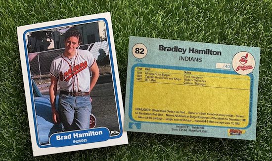
I had thought in the past of making a Brad Hamilton baseball card with him in his Cleveland Indians jersey. I think the reason I held off before was because the jersey is worn during kind of a touchy scene when Brad unknowingly gave his younger sister Stacy a ride to the abortion clinic. For myself I can't really separate the jersey from the scene. But, even so I thought it could still make for a good custom baseball card. Since I used the '82 Topps design for the two series of Fast Times movie cards I wanted to use one of the designs from the other two major companies; Donruss or Fleer.
Since, in my opinion, the 1982 Donruss design is completely horrendous it was going to be Fleer. The 1982 Fleer baseball design is kind of generic looking but I think that also gives it charm and versatility. On the back I used Brad's work resume in place of baseball stats and added a few Brad Hamilton highlights at the bottom.
It would have been nice to pair these with the Spicoli card I made back in July. That card was one the few times I was able to time a card with a date being that I wanted to put it out around the Fourth of July. I was more more disciplined in doing that these newest card would have been done around the time of the anniversary date, but having them out in the same year is good enough for me.


No comments:
Post a Comment